

Data Visualization with Matplotlib and Seaborn
A model can only be as good as your understanding of the data it learns from, and the fastest way to understand a dataset is to look at it. This section teaches the two plotting libraries used in every notebook of the course: Matplotlib, which draws any plot you describe, and Seaborn, which draws statistical plots from a DataFrame in one line. You will draw the same chart types as the week 2 notebook, compute a histogram, a boxplot and a correlation by hand, and learn which chart answers which question.
Objectives
By the end of the section you should be able to:
- Draw a scatter plot, a bar chart, a histogram, a line plot and a boxplot with Matplotlib, and add a title, labels, ticks, a grid, text, lines and a legend.
- Compute the bins of a histogram and the parts of a boxplot (median, quartiles, whiskers, outliers) by hand.
- Plot straight from a pandas DataFrame with
df.plot.scatteranddf.plot.hist. - Draw group comparisons and trends with Seaborn:
boxplot,violinplot,regplotandlmplot. - Compute a correlation coefficient, build a correlation matrix with
np.corrcoef, and read it as a heatmap. - Choose the chart that fits a question and a dataset, and use these plots in your project proposal.
Where this sits in the course
Week 2 of the plan has three parts:
- The notebook.
Matplotlib_Seaborn_basicsfrom the course repository, on three small datasets. - A real-world scenario. The plan leaves this column empty for week 2, so we work with the notebook's own situations: patients visiting a clinic, a month of opinion polls for two candidates, and a table of 178 wines described by 13 measurements.
- A project milestone. Project/Paper Proposal: this week your team writes the proposal for its project or paper.
In week 1 you loaded data into pandas DataFrames and worked with them. This week you look at that data. From week 3 on, every model starts with the plots you learn today.
| Part | What we do | Time |
|---|---|---|
| 1 | Matplotlib on the clinic data: scatter, styling, bar, histogram by hand | 30 min |
| 2 | The poll data: a line plot, and a boxplot by hand | 20 min |
| 3 | Pandas and Seaborn on the wine data | 20 min |
| 4 | Correlation, the heatmap, and choosing a chart | 15 min |
| 5 | Practice with answers, then takeaways | 35 min |
Open the notebook
Open Matplotlib_Seaborn_basics in Colab
Two changes make your run match this page exactly:
- The line plot uses random numbers (
np.random.randn), so every run gives a different month of polls. Addnp.random.seed(0)before the cell that createscandidate_Aandcandidate_B, and you get the numbers shown here. - The clinic data lists each patient by a first name. This page uses the IDs
P1toP12in the same order.
Every figure on this page was produced by running the notebook's code.
Part 1: Matplotlib on the clinic data
The data
Twelve patients visited a clinic. For each one we know the age in years, the weight in kg and the height in cm:
people = ['P1', 'P2', 'P3', 'P4', 'P5', 'P6',
          'P7', 'P8', 'P9', 'P10', 'P11', 'P12']
age = [21, 12, 32, 45, 37, 18, 28, 52, 5, 40, 48, 15]
weight = [55, 35, 77, 68, 70, 60, 72, 69, 18, 65, 82, 48]
height = [160, 135, 170, 165, 173, 168, 175, 159, 105, 171, 155, 158]
These are plain Python lists: Matplotlib accepts lists, NumPy arrays and DataFrame columns alike.
A first scatter plot
A scatter plot draws one dot per row, with one number on each axis. It answers the question: do these two numbers move together?
import matplotlib.pyplot as plt

plt.scatter(age, height)
plt.show()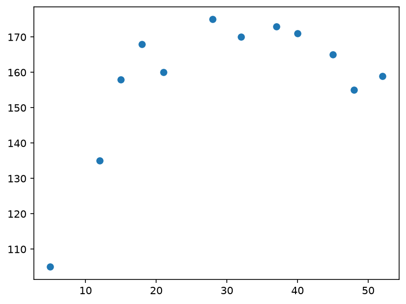
Height rises quickly through childhood and then stops rising: the patients older than about 20 are all between 155 and 175 cm. The dot at the bottom left is P9, a 5-year-old at 105 cm.
Adding bells and whistles
The plot above is correct but bare. The notebook adds, one line each: the figure size, a title, axis labels, custom ticks, a grid, text on the plot, a vertical and a horizontal line, and a legend.
plt.figure(figsize=(8, 6))
plt.title("Plot of Age vs. Height (in cms)\n", fontsize=20, fontstyle='italic')
plt.xlabel("Age (years)", fontsize=16)
plt.ylabel("Height (cms)", fontsize=16)
plt.grid(True)
plt.ylim(100, 200)
plt.xticks([i * 5 for i in range(12)], fontsize=15)
plt.yticks(fontsize=15)
plt.scatter(x=age, y=height, c='orange', s=150, edgecolors='k')
plt.text(x=15, y=105, s="Height increases up to around \n20 years and then tapers off",
         fontsize=15, rotation=30, linespacing=2)
plt.text(x=22, y=185, s="Nobody has a height beyond 180 cm", fontsize=15)
plt.vlines(x=20, ymin=100, ymax=180, linestyles='dashed', color='blue', lw=3)
plt.hlines(y=180, xmin=0, xmax=55, linestyles='dashed', color='red', lw=3)
plt.legend(['Height in cms'], loc=2, fontsize=14)
plt.show()| Call | What it does |
|---|---|
plt.figure(figsize=(8, 6)) | a new figure 8 by 6 inches |
plt.title, plt.xlabel, plt.ylabel | the texts around the plot, with their font size |
plt.ylim(100, 200) | the visible range of the y axis |
plt.xticks(list) | where the tick marks of the x axis go |
plt.scatter(..., c, s, edgecolors) | dot colour, dot size and outline colour |
plt.text(x, y, s) | writes the text s at the data point (x, y) |
plt.vlines, plt.hlines | vertical and horizontal line segments |
plt.legend(list, loc=2) | a legend in the upper-left corner |
Worked example: which ticks?
plt.xticks([i * 5 for i in range(12)]) receives the list built by the comprehension. range(12) gives i = 0, 1, ..., 11, so the list is i * 5:
[0, 5, 10, 15, 20, 25, 30, 35, 40, 45, 50, 55]Twelve tick marks from 0 to 55, one every 5 years, which covers the oldest patient (52).
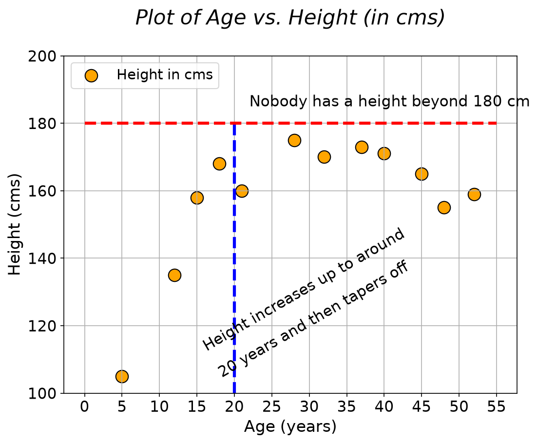
The dashed blue line marks 20 years, where the rise stops, and the dashed red line marks 180 cm, a height nobody reaches. Text and lines turn a plot into an argument.
Bar chart
A bar chart compares one number across named items. Every bar starts at zero, so the heights can be compared directly.
plt.figure(figsize=(12, 4))
plt.title("People's weight in kgs", fontsize=16, fontstyle='italic')
plt.bar(x=people, height=weight, width=0.6, color='orange', edgecolor='k', alpha=0.6)
plt.xlabel("People", fontsize=15)
plt.xticks(fontsize=14, rotation=30)
plt.yticks(fontsize=14)
plt.ylabel("Weight (in kgs)", fontsize=15)
plt.show()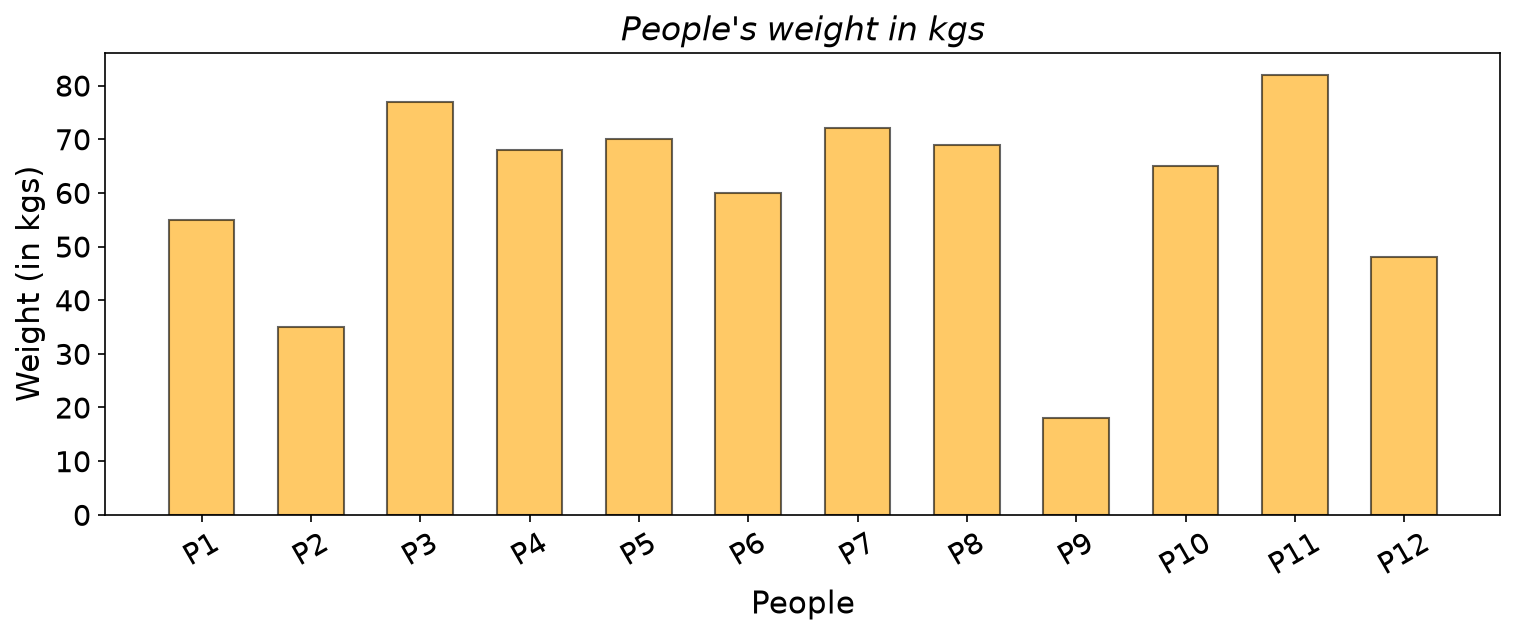
width=0.6 makes each bar 60 percent of its slot, alpha=0.6 makes it partly transparent, and rotation=30 tilts the labels so they do not collide. The tallest bar is P11 (82 kg) and the shortest P9 (18 kg).
Histogram
A histogram shows the shape of one numeric column: it cuts the range of the values into equal intervals called bins and draws one bar per bin, as tall as the number of values that fall inside it.
plt.figure(figsize=(7, 5))
plt.hist(weight, color='red', edgecolor='k', alpha=0.75, bins=5)
plt.title("Histogram of patient weight", fontsize=18)
plt.xlabel("Weight in kgs", fontsize=15)
plt.show()
Worked example: the five bins of the weights, by hand
Step 1: bin width and edges. With bins=5, Matplotlib splits the range from the smallest value (18) to the largest (82) into 5 equal bins:
width = (82 - 18) / 5 = 64 / 5 = 12.8
edges = 18, 30.8, 43.6, 56.4, 69.2, 82
Step 2: count. Each bin includes its left edge and excludes its right edge, except the last bin, which also includes 82.
| Bin | Weights inside | Count |
|---|---|---|
| 18 to 30.8 | 18 | 1 |
| 30.8 to 43.6 | 35 | 1 |
| 43.6 to 56.4 | 55, 48 | 2 |
| 56.4 to 69.2 | 68, 60, 69, 65 | 4 |
| 69.2 to 82 | 77, 70, 72, 82 | 4 |
The counts add up to 12, one per patient. plt.hist returns the same counts, [1, 1, 2, 4, 4], and the same edges.
Step 3: compare with the plot.
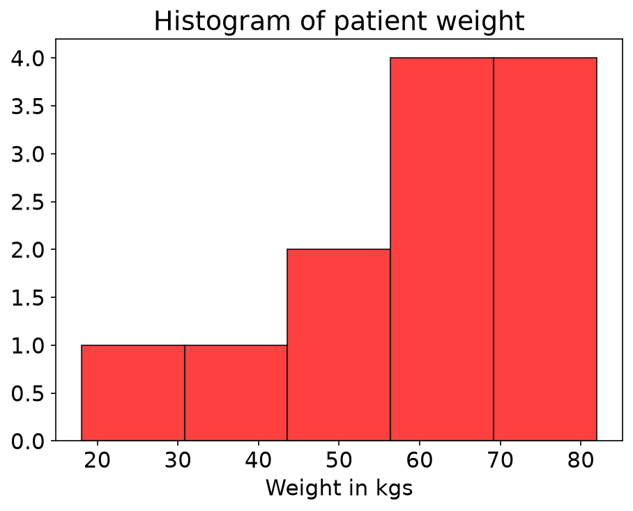
Most patients weigh between 56.4 and 82 kg; the two short bars on the left are the two children.
Part 2: The poll data
A month of polls
The notebook invents 30 days of poll results for two candidates. Candidate A starts at 50 percent and gains 0.07 points a day; candidate B starts at 50 percent and loses 0.1 points a day. Random noise is added to both:
import numpy as np

np.random.seed(0)          # added: makes the random numbers repeatable
days = np.arange(1, 31)
candidate_A = 50 + days * 0.07 + 2 * np.random.randn(30)
candidate_B = 50 - days * 0.1 + 3 * np.random.randn(30)
np.random.randn(30) draws 30 random numbers from the standard normal distribution; multiplying by 2 or 3 sets how noisy each candidate is.
Line plot
A line plot joins each point to the next, so it fits data whose x axis has a real order, usually time.
ymin = min(candidate_A.min(), candidate_B.min())
ymax = max(candidate_A.max(), candidate_B.max())

plt.style.use('fivethirtyeight')
plt.figure(figsize=(12, 5))
plt.title("Time series plot of poll percentage over a month\n", fontsize=20, fontstyle='italic')
plt.xlabel("Days", fontsize=16)
plt.ylabel("Poll percentage (%)", fontsize=16)
plt.grid(True)
plt.ylim(ymin * 0.98, ymax * 1.02)
plt.xticks([i * 2 for i in range(16)], fontsize=14)
plt.yticks(fontsize=15)
plt.plot(days, candidate_A, 'o-', markersize=10, c='blue', lw=2)
plt.plot(days, candidate_B, '^-', markersize=10, c='green', lw=2)
plt.legend(['Poll percentage of candidate A (%)', 'Poll percentage of candidate B (%)'],
           loc=2, fontsize=14)
plt.show()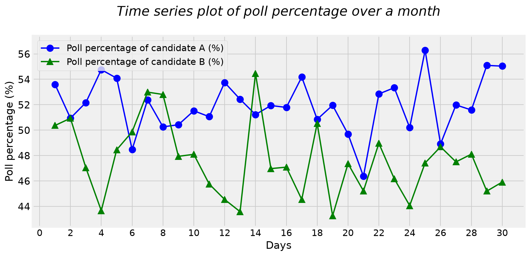
'o-'means circle markers joined by a solid line,'^-'triangles joined by a line.plt.style.use('fivethirtyeight')switches the whole look (background, fonts, grid). A style stays on for every later plot until you change it.- The smallest value is
43.258(candidate B) and the largest56.290(candidate A), soplt.ylim(ymin * 0.98, ymax * 1.02)shows the range from42.393to57.415: 2 percent of room below and above the data. - Candidate A is above candidate B on 26 of the 30 days; B is ahead only on days 6, 7, 8 and 14.
Boxplot: the idea
A boxplot summarises one numeric column with five numbers and marks the unusual values:
- The median is the middle value of the sorted data. It is the line inside the box.
- The first quartile
Q1and the third quartileQ3cut off the lowest quarter and the highest quarter. The box spans from Q1 to Q3, so it holds the middle half of the data. - The interquartile range is
IQR = Q3 - Q1, the length of the box. - The fences lie 1.5 IQR below Q1 and 1.5 IQR above Q3. They are not drawn; they only decide what is unusual.
- The whiskers run from the box to the farthest values that are still inside the fences.
- Values beyond a fence are outliers, drawn one by one as circles.
Matplotlib finds a quartile the same way as np.percentile: sort the n values, number them from position 0 to n - 1, and go to position 0.25 (n - 1) for Q1, 0.5 (n - 1) for the median and 0.75 (n - 1) for Q3. When the position falls between two values, take that fraction of the gap between them.
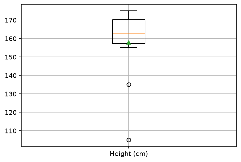
Worked example: a boxplot of the 12 heights, by hand
Step 1: sort and find the median.
sorted: 105, 135, 155, 158, 159, 160, 165, 168, 170, 171, 173, 175
position:  0    1    2    3    4    5    6    7    8    9   10   11
n = 12, so the median is at position 0.5 x 11 = 5.5, halfway between 160 (position 5) and 165 (position 6):
median = 160 + 0.5 x (165 - 160) = 162.5Step 2: the quartiles.
Q1 at position 0.25 x 11 = 2.75:  155 + 0.75 x (158 - 155) = 157.25
Q3 at position 0.75 x 11 = 8.25:  170 + 0.25 x (171 - 170) = 170.25
Step 3: IQR and fences.
IQR = 170.25 - 157.25 = 13
lower fence = 157.25 - 1.5 x 13 = 137.75
upper fence = 170.25 + 1.5 x 13 = 189.75
Step 4: whiskers, outliers and mean.
- The lower whisker goes to the smallest height still at or above 137.75: 155. The upper whisker goes to the largest height at or below 189.75: 175.
- 105 and 135 are below the lower fence, so they are outliers: the two children, P9 and P2.
- The mean is
1894 / 12 = 157.83, lower than the median of 162.5: the two small values pull the mean down, while the median hardly notices them.
plt.boxplot(x=[height], showmeans=True) draws exactly these numbers:
To replay the construction step by step, open the boxplot builder full screen. Press Step to add one part of the box at a time, and drag any dot to see how the median, the quartiles and the outliers respond.
The notebook's boxplot of the polls
plt.style.use('ggplot')
plt.boxplot(x=[candidate_A, candidate_B], showmeans=True)
plt.grid(True)
plt.xticks([1, 2], ['Candidate A', 'Candidate B'])
plt.show()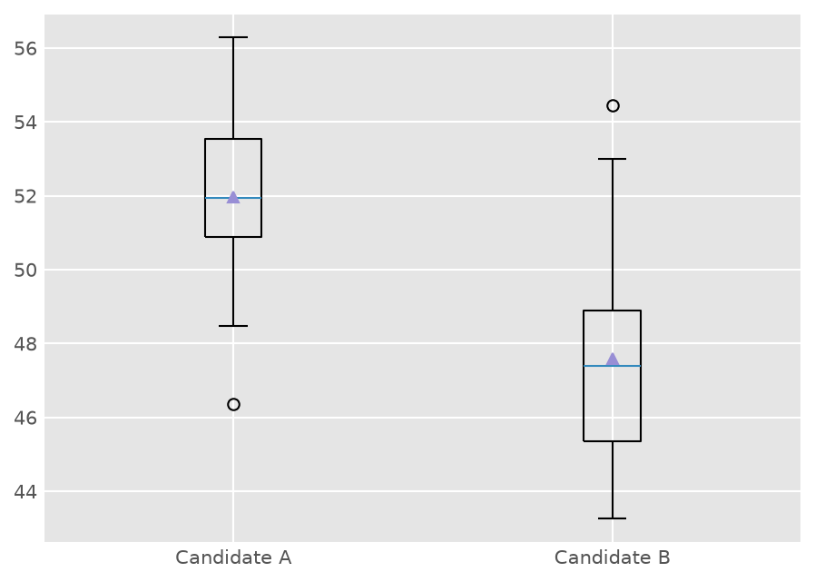
Passing a list of two arrays draws two boxes side by side, and plt.xticks([1, 2], [...]) replaces the default tick numbers 1 and 2 with names.
| Candidate A | Candidate B | |
|---|---|---|
| Median | 51.947 | 47.389 |
| Q1 to Q3 | 50.872 to 53.533 | 45.349 to 48.892 |
| Whiskers | 48.465 to 56.290 | 43.258 to 52.991 |
| Outliers | 46.364 | 54.452 |
| Mean (triangle) | 51.971 | 47.581 |
The boxes barely overlap: on most days candidate A polls higher. The line plot showed the trend over time; the boxplot throws the time away and compares the two distributions.
Part 3: Pandas and Seaborn on the wine data
Load the data
import pandas as pd

df = pd.read_csv("https://raw.githubusercontent.com/tirthajyoti/"
                 "Stats_data_science_ValleyML/master/Notebooks/Data/wine.data.csv")
df.head()
The notebook downloads the same file with !wget into a Data folder and reads Data/wine.data.csv; reading the address directly does the same in one step.
df.shape is (178, 14): 178 wines, a Class column with the values 1, 2 and 3 (59, 71 and 48 wines), and 13 measurements such as Alcohol, Flavanoids, Color intensity and Proline.
   Class  Alcohol  Malic acid   Ash  Alcalinity of ash
0      1    14.23        1.71  2.43               15.6
1      1    13.20        1.78  2.14               11.2
2      1    13.16        2.36  2.67               18.6
Before the pandas plots, the notebook resets the style changed in Part 2:
import matplotlib as mpl
mpl.rcParams.update(mpl.rcParamsDefault)
Pandas plots straight from a DataFrame
A DataFrame can draw itself through Matplotlib; you name the columns instead of passing lists.
df.plot.scatter('Alcohol', 'Color intensity')
plt.show()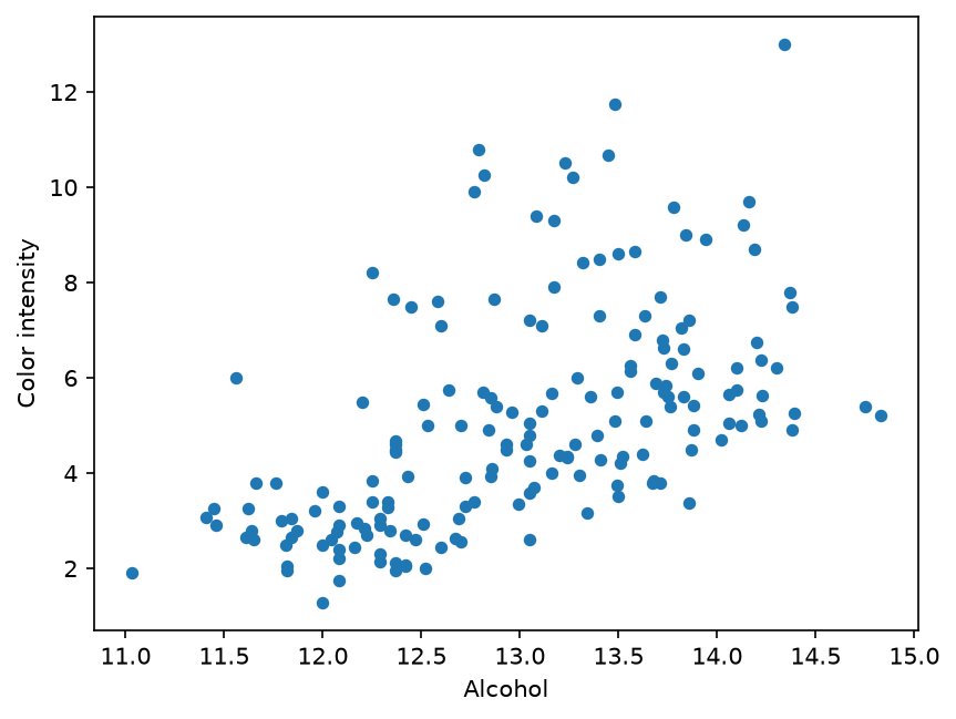
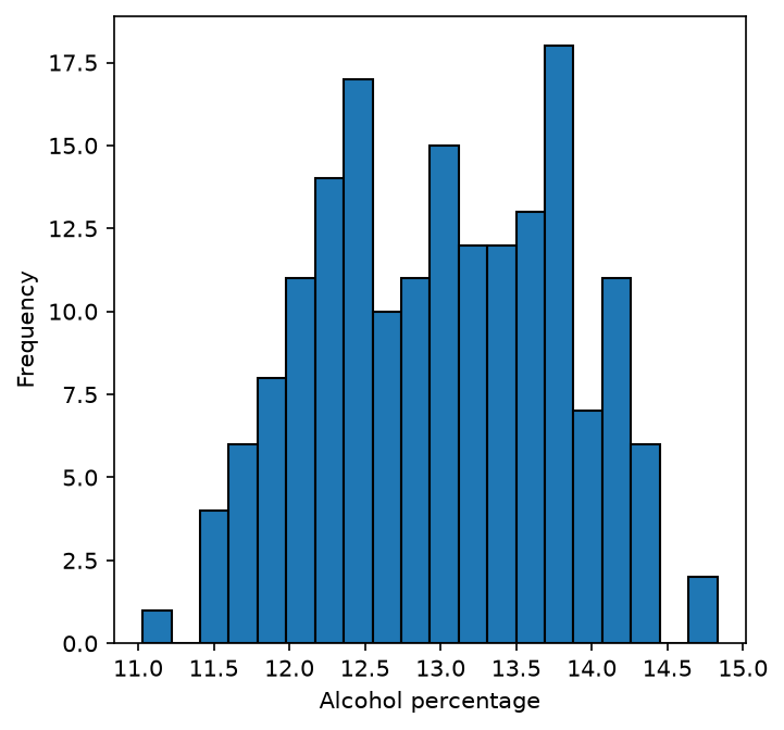
df['Alcohol'].plot.hist(bins=20, figsize=(5, 5), edgecolor='k')
plt.xlabel('Alcohol percentage')
plt.show()
Worked example: the width of the 20 alcohol bins
The alcohol values run from 11.03 to 14.83, and there are 20 bins:
width = (14.83 - 11.03) / 20 = 3.80 / 20 = 0.19The tallest bin, from 13.69 to 13.88, holds 18 wines, and the 20 counts add up to 178.
Seaborn: statistical plots in one line
Seaborn works on a DataFrame: you name the columns with x=, y= and data=, and it groups, colours and summarises for you.
import seaborn as sns

sns.boxplot(x='Class', y='Alcohol', data=df)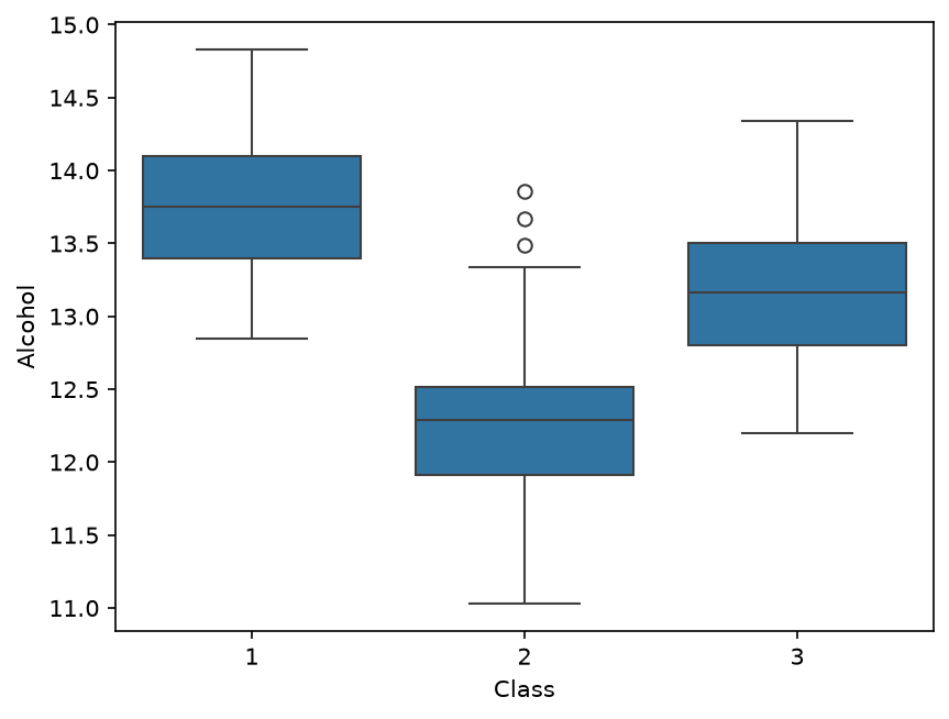
One call draws one box per class. The medians are 13.75 (class 1), 12.29 (class 2) and 13.165 (class 3), so class 1 wines are the strongest and class 2 the weakest. Class 2 has three outliers above its upper whisker: 13.49, 13.67 and 13.86.
Violin plot
sns.violinplot(x='Class', y='Alcohol', data=df)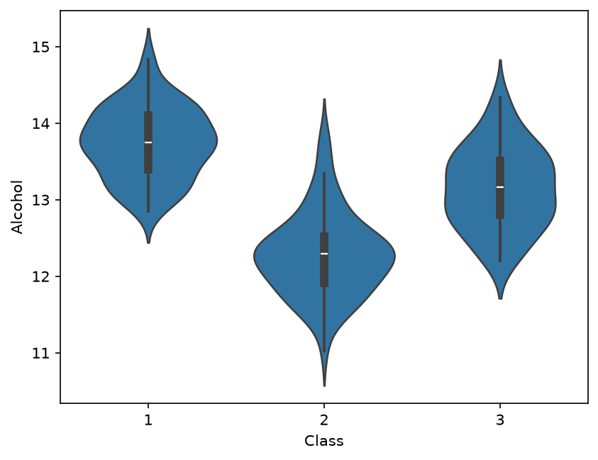
A violin plot combines a boxplot with the shape of a histogram: the width of the violin at each height shows how many wines have that alcohol value, and the small box inside shows the quartiles. Class 2 is widest near 12.3, which the plain boxplot cannot show.
regplot: a scatter plot with a fitted line
sns.regplot(x='Alcohol', y='Color intensity', data=df)
plt.show()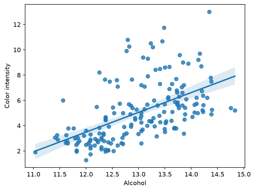
regplot draws the scatter plot, the straight line that fits it best (a linear regression, the topic of week 3), and a shaded band, the confidence interval, showing how uncertain the line is. The fitted line here is
Color intensity = 1.560 x Alcohol - 15.226(the numbers come from np.polyfit(df['Alcohol'], df['Color intensity'], 1), which computes the same line).
Worked example: read the line at Alcohol = 13
1.560 x 13 - 15.226 = 5.054 (5.057 with the unrounded slope and intercept)A wine with 13 percent alcohol is expected to have a colour intensity near 5.05. The slope is positive: more alcohol goes with more colour, on average.
lmplot: one fitted line per group
sns.lmplot(x='Alcohol', y='Color intensity', hue='Class', data=df)
plt.show()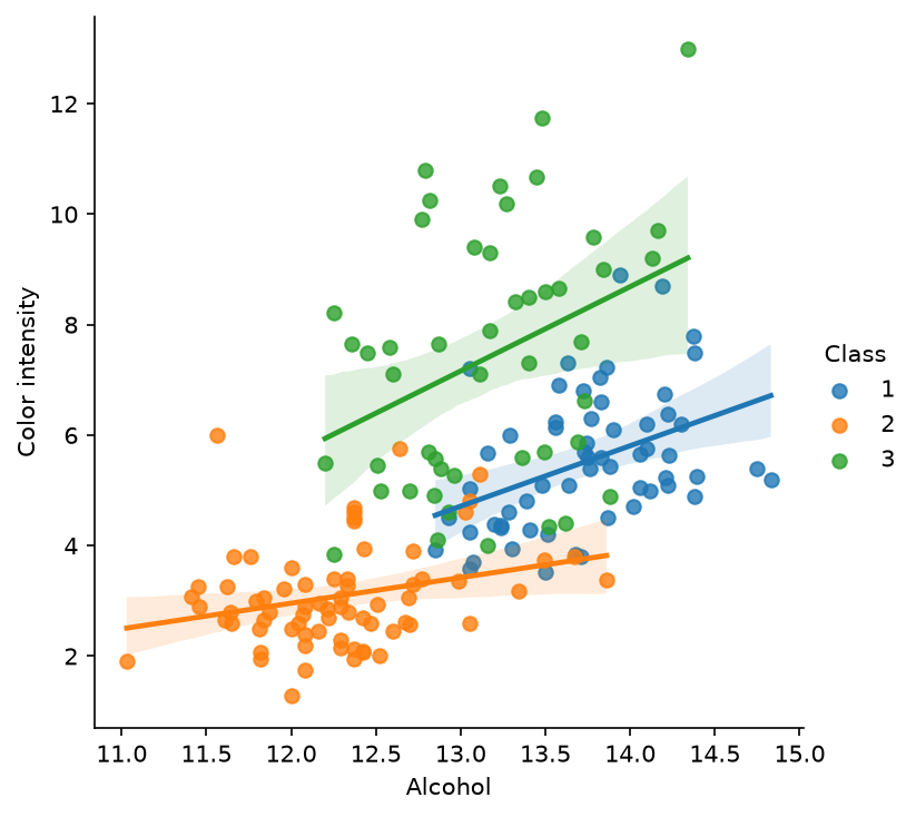
hue='Class' colours the dots by class and fits a separate line to each. The slopes differ: 1.094 for class 1, 0.464 for class 2 and 1.527 for class 3. The single line of regplot mixes three groups that behave differently.
Part 4: Correlation and the heatmap
The correlation coefficient
The correlation coefficient r measures how closely two columns follow a straight line. It is always between -1 and 1:
rclose to 1: when one column is high, the other tends to be high.rclose to -1: when one is high, the other tends to be low.rclose to 0: no straight-line relation.
For columns x and y with means mx and my:
r = sum of (x - mx)(y - my) / square root of ( sum of (x - mx)^2 x sum of (y - my)^2 )Worked example: r for four patients
Take patients P1, P4, P6 and P10: heights 160, 165, 168, 171 and weights 55, 68, 60, 65. The means are mx = 664 / 4 = 166 and my = 248 / 4 = 62.
Step 1: deviations from the means.
| Patient | x - mx | y - my | product | (x - mx)^2 | (y - my)^2 |
|---|---|---|---|---|---|
| P1 | -6 | -7 | 42 | 36 | 49 |
| P4 | -1 | 6 | -6 | 1 | 36 |
| P6 | 2 | -2 | -4 | 4 | 4 |
| P10 | 5 | 3 | 15 | 25 | 9 |
| Sum | 47 | 66 | 98 |
Step 2: combine.
r = 47 / square root of (66 x 98) = 47 / 80.424 = 0.584np.corrcoef([160, 165, 168, 171], [55, 68, 60, 65])[0, 1] prints 0.5844. The relation is positive but loose. Over all 12 patients height and weight give r = 0.848: with only four points, one patient changes the answer a lot (P4 is shorter than the mean but heavier).
The correlation matrix of the wine data
corr_mat = np.corrcoef(df, rowvar=False)
corr_mat.shape                 # (14, 14)
corr_df = pd.DataFrame(corr_mat, columns=df.columns, index=df.columns)
rowvar=False tells NumPy that the variables are the columns, not the rows. With 14 columns there are 14 x 14 = 196 values of r: the diagonal is 1 (each column with itself), and the matrix is symmetric, since r of a with b equals r of b with a. print(np.round(corr_mat, 3)) prints the whole matrix; its first row holds the correlations of Class with every column:
[ 1.    -0.328  0.438 -0.05   0.518 -0.209 -0.719 -0.847  0.489 -0.499
  0.266 -0.617 -0.788 -0.634]
The heatmap
sns.heatmap(corr_df, linewidth=1, cmap='plasma')
plt.show()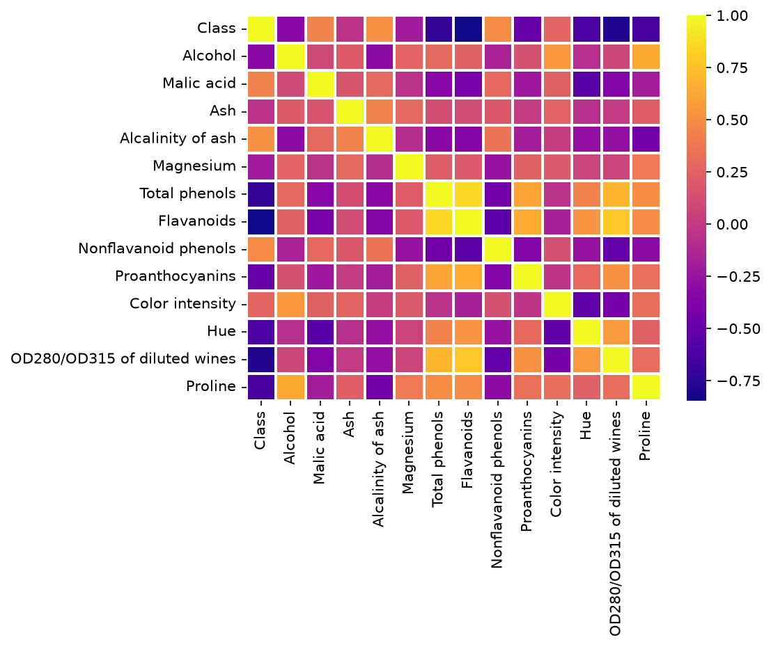
A heatmap colours every cell of the matrix. With cmap='plasma', yellow means r near 1 and dark blue the most negative values.
Worked example: read the heatmap
- Which measurement is most related to
Class? The darkest cell in theClassrow isFlavanoids, r = -0.847: class 1 wines have the most flavanoids and class 3 the fewest. Next comeOD280/OD315 of diluted wines(-0.788) andTotal phenols(-0.719). - Which two measurements are most related to each other?
Total phenolsandFlavanoids, r = 0.865, the brightest cell off the diagonal. - Which pair is least related?
AshandOD280/OD315 of diluted wines, r = 0.004.
Class is a label coded 1, 2 and 3. A correlation with it only says whether wines with a larger class number tend to have larger or smaller values of a measurement; here that works because the three classes happen to be ordered along Flavanoids.
Choosing a chart
| Your question | Chart | In the notebook |
|---|---|---|
| Do two numbers move together? | scatter plot, regplot | age against height, alcohol against colour |
| How does one number change over time? | line plot | the polls over 30 days |
| How do named items compare on one number? | bar chart | weight per patient |
| What shape does one column have? | histogram | weights, alcohol |
| How do groups differ in spread and outliers? | boxplot, violin plot | candidates, alcohol per class |
| Which of many columns are related? | correlation heatmap | 14 wine columns |
The same data can be drawn many ways, and not every way makes sense: a line plot through the 12 patients joins people who have nothing to do with each other, because the patients have no order. Open the chart chooser full screen, switch between the six charts on the clinic, poll and wine data, change the bins and the colouring, and read when each chart fits.
Common mistakes
- Using a line plot for rows that have no order; use a scatter plot or a bar chart instead.
- Judging a histogram without trying other bin counts: too few bins hide the shape, too many turn it into noise.
- Forgetting that
plt.style.usestays on for every later plot; reset it withmpl.rcParams.update(mpl.rcParamsDefault). - Calling the circles of a boxplot errors. They are only values beyond 1.5 IQR; check them before deleting anything.
- Reading r = 0 as "no relation at all": r only measures straight-line relations.
- Treating a correlation as a cause: two columns can move together because both follow a third one.
Project milestone: Project/Paper Proposal
This week each team writes its proposal. The plots of this section make it concrete:
- State the idea, or the paper you will reproduce, in two or three sentences.
- Name the dataset: where it comes from, how many rows and columns, and which column is the target.
- Load it with pandas and draw a histogram of the target, or a bar chart of its classes.
- Draw a boxplot or a scatter plot of the target against the column you expect to matter most.
- Draw the correlation heatmap and write down the strongest relations you see.
- Put the plots in the proposal with one sentence under each saying what it shows.
Next week the milestone continues with data exploration and cleaning, starting from these plots.
Key takeaways
- Matplotlib builds a figure call by call: data first, then title, labels, ticks, grid, text, lines and legend.
- A histogram cuts the range into equal bins; the bin count changes what you see.
- A boxplot shows the median, the quartiles, whiskers up to 1.5 IQR, and outliers beyond.
- Pandas and Seaborn draw from DataFrame columns by name; Seaborn groups by a column with
x=orhue=. - r measures straight-line relation between -1 and 1; a heatmap of the correlation matrix shows every pair at once.
- Pick the chart from the question: over time, compare, shape, spread, or relation.
Practice
About 30 minutes. Try each task before you read its answer at the end of the page.
Practice 1: a histogram by hand (about 7 minutes)
Ten visitors have these ages: 12, 15, 21, 22, 26, 30, 31, 33, 38, 44. For plt.hist(ages, bins=4):
- Compute the bin width and the five bin edges.
- Count the values in each bin.
Practice 2: a boxplot by hand (about 8 minutes)
Ten values: 48, 52, 55, 57, 58, 60, 61, 63, 66, 95. For plt.boxplot(x=[values], showmeans=True), find the median, Q1, Q3, the IQR, the two fences, the two whisker ends, the outliers and the mean.
Practice 3: r by hand (about 5 minutes)
Compute r for x = [1, 2, 3, 4] and y = [2, 4, 5, 9].
Practice 4: in Colab, on the wine data (about 10 minutes)
- Draw
sns.boxplot(x='Class', y='Flavanoids', data=df). Which class has the highest median? Which boxes show outliers? - Draw
df['Proline'].plot.hist(bins=10). How many wines are in the tallest bin, and what are its edges? (Usenp.histogram(df['Proline'], bins=10)to read the exact numbers.) - Draw
sns.regplot(x='Total phenols', y='Flavanoids', data=df). Is the slope positive or negative? Compute r withnp.corrcoef. - Draw the heatmap of only four columns:
cols = ['Class', 'Alcohol', 'Flavanoids', 'Proline'], thennp.corrcoef(df[cols], rowvar=False). Which pair has the largest r in absolute value?
Answers
Answer 1
- Width:
(44 - 12) / 4 = 32 / 4 = 8. Edges:12, 20, 28, 36, 44. - Counts:
| Bin | Values | Count |
|---|---|---|
| 12 to 20 | 12, 15 | 2 |
| 20 to 28 | 21, 22, 26 | 3 |
| 28 to 36 | 30, 31, 33 | 3 |
| 36 to 44 | 38, 44 | 2 |
The last bin includes 44. np.histogram(ages, bins=4) returns [2, 3, 3, 2] and the same edges.
Answer 2
n = 10, so the positions run from 0 to 9.
- Median at position
0.5 x 9 = 4.5:58 + 0.5 x (60 - 58) = 59. - Q1 at position
0.25 x 9 = 2.25:55 + 0.25 x (57 - 55) = 55.5. - Q3 at position
0.75 x 9 = 6.75:61 + 0.75 x (63 - 61) = 62.5. - IQR:
62.5 - 55.5 = 7. Fences:55.5 - 10.5 = 45and62.5 + 10.5 = 73. - Whiskers: from 48 (the smallest value at or above 45) to 66 (the largest value at or below 73).
- Outlier: 95.
- Mean:
615 / 10 = 61.5, above the median of 59: the outlier pulls it up.
Answer 3
- Means:
mx = 10 / 4 = 2.5,my = 20 / 4 = 5. - Deviations: x gives
-1.5, -0.5, 0.5, 1.5; y gives-3, -1, 0, 4. - Sum of products:
4.5 + 0.5 + 0 + 6 = 11. Sums of squares:2.25 + 0.25 + 0.25 + 2.25 = 5and9 + 1 + 0 + 16 = 26. r = 11 / square root of (5 x 26) = 11 / 11.402 = 0.965.
A strong positive relation: np.corrcoef gives 0.9648.
Answer 4
- The medians of
Flavanoidsare 2.98 (class 1), 2.03 (class 2) and 0.685 (class 3), so class 1 is highest. Class 2 has one outlier above (5.08) and class 3 one outlier above (1.57); class 1 has none. - The tallest bin holds 41 wines, between 558.4 and 698.6. The ten counts are
22, 37, 41, 19, 13, 19, 8, 13, 4, 2. - The slope is positive: the fitted line is
Flavanoids = 1.380 x Total phenols - 1.138, and r = 0.865. - The four-column matrix, rounded to three decimals:
| Class | Alcohol | Flavanoids | Proline | |
|---|---|---|---|---|
| Class | 1 | -0.328 | -0.847 | -0.634 |
| Alcohol | -0.328 | 1 | 0.237 | 0.644 |
| Flavanoids | -0.847 | 0.237 | 1 | 0.494 |
| Proline | -0.634 | 0.644 | 0.494 | 1 |
The largest in absolute value is Class and Flavanoids, r = -0.847, the same cell as in the full 14-column heatmap: removing columns does not change the r of the columns that remain.