Logo
Machine Learning (2026-2027) - Data Visualization with Matplotlib and Seaborn

In the print dialog, choose "Save as PDF" as the destination.

Machine Learning, Week 2

Data Visualization with Matplotlib and Seaborn

Look at the data before you model it: the charts every notebook of the course uses, and when each one fits.

Objectives

  • Draw scatter, bar, histogram, line and box plots with Matplotlib, with titles, labels, ticks and legends
  • Compute histogram bins and the parts of a boxplot by hand
  • Plot straight from a DataFrame with df.plot.scatter and df.plot.hist
  • Compare groups with Seaborn: boxplot, violinplot, regplot, lmplot
  • Compute a correlation r and read a correlation heatmap
  • Choose the chart that fits the question, and use it in your proposal

Week 2 of the plan

Where This Sits in the Course

  • Notebook: Matplotlib_Seaborn_basics, on three small datasets
  • Real-world scenario: the plan leaves it open this week, so we use the notebook's own: clinic patients, a month of polls, 178 wines
  • Project milestone this week: Project/Paper Proposal

Plan for the Two Hours

PartWhat we doTime
1Matplotlib on the clinic data, a histogram by hand30 min
2The poll data: line plot, a boxplot by hand20 min
3Pandas and Seaborn on the wine data20 min
4Correlation, the heatmap, choosing a chart15 min
5Practice with answers, then takeaways35 min

Open the Notebook in Colab

text
https://colab.research.google.com/github/
tirthajyoti/Machine-Learning-with-Python/blob/master/
Pandas%20and%20Numpy/Matplotlib_Seaborn_basics.ipynb
Join the three lines into one address, or click "Open in Colab" on the lesson page.

Part 1

Matplotlib on the Clinic Data

One figure, built call by call

The Clinic Data

Twelve patients: age in years, weight in kg, height in cm

python
people = ['P1', 'P2', 'P3', 'P4', 'P5', 'P6',
          'P7', 'P8', 'P9', 'P10', 'P11', 'P12']
age    = [21, 12, 32, 45, 37, 18,
          28, 52, 5, 40, 48, 15]
weight = [55, 35, 77, 68, 70, 60,
          72, 69, 18, 65, 82, 48]
height = [160, 135, 170, 165, 173, 168,
          175, 159, 105, 171, 155, 158]
  • Plain Python lists, one value per patient, in the same order
  • Matplotlib accepts lists, NumPy arrays and DataFrame columns alike
  • Question: is there a relationship between these features?

A First Scatter Plot

  • One dot per patient: age on x, height on y
python
import matplotlib.pyplot as plt

plt.scatter(age, height)
plt.show()
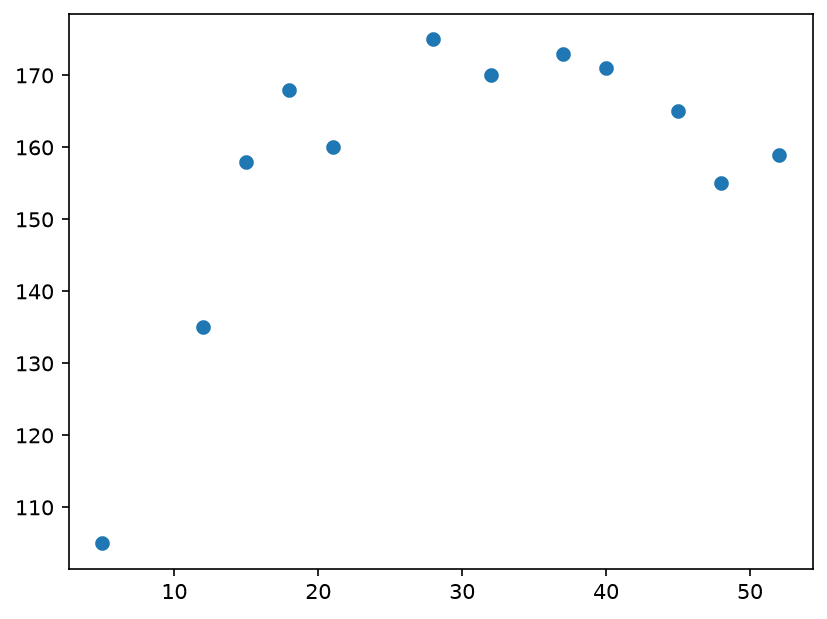
Scatter plot of age against height for the 12 patients

Bells and Whistles

Each extra call adds one element to the same figure

CallAdds
plt.figure(figsize=(8, 6))figure size in inches
plt.title, plt.xlabel, plt.ylabelthe texts around the plot
plt.ylim(100, 200)the visible y range
plt.xticks(list)where x tick marks go
CallAdds
plt.scatter(c=, s=, edgecolors=)dot colour, size, outline
plt.text(x, y, s)text at a data point
plt.vlines, plt.hlinesvertical, horizontal lines
plt.legend(list, loc=2)a legend, upper left

Worked Example: Which Ticks?

python
plt.xticks([i * 5 for i in range(12)],
           fontsize=15)
text
[0, 5, 10, 15, 20, 25, 30, 35, 40, 45, 50, 55]
range(12) gives i = 0 to 11, times 5: twelve ticks up to 55.
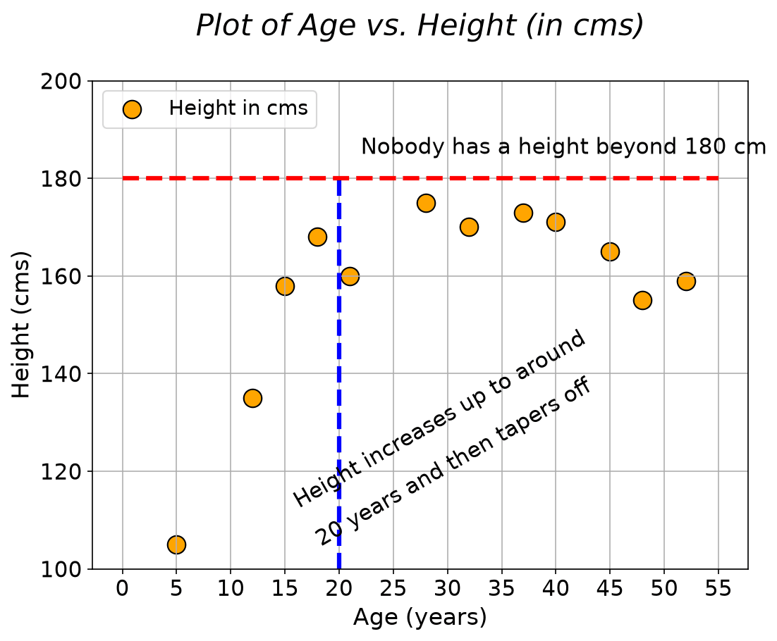
The styled scatter plot with title, grid, text, dashed lines and a legend

Bar Chart

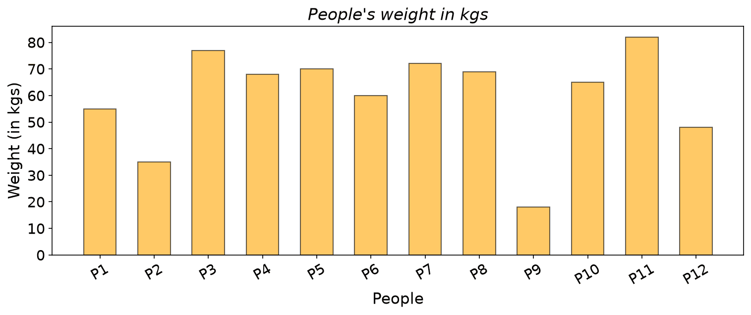
One number across named items; every bar starts at zero

python
plt.figure(figsize=(12, 4))
plt.bar(x=people, height=weight,
        width=0.6, color='orange',
        edgecolor='k', alpha=0.6)
plt.xticks(fontsize=14, rotation=30)
plt.show()
  • width=0.6: each bar fills 60% of its slot
  • alpha=0.6: partly transparent
  • rotation=30: tilted labels
Bar chart of the weight of each patient

Step 1 of 3

Worked Example: Histogram Bins

python
plt.hist(weight, color='red', edgecolor='k', alpha=0.75, bins=5)
w = 82 − 185 = 645 = 12.8

Step 2 of 3

Step 2: Count the Values in Each Bin

A bin holds its left edge, not its right one; the last bin also holds 82

BinWeights insideCount
18 to 30.8181
30.8 to 43.6351
43.6 to 56.455, 482
56.4 to 69.268, 60, 69, 654
69.2 to 8277, 70, 72, 824

Step 3 of 3

Step 3: Check Against the Plot

  • Counts 1, 1, 2, 4, 4 add up to 12, one per patient
  • plt.hist returns the same counts and edges
  • The two short bars on the left are the two children
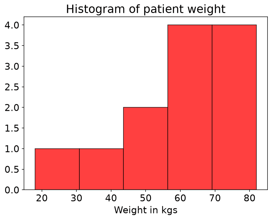
Histogram of the 12 weights with 5 bins

Part 2

The Poll Data

A line through time, and a box around a spread

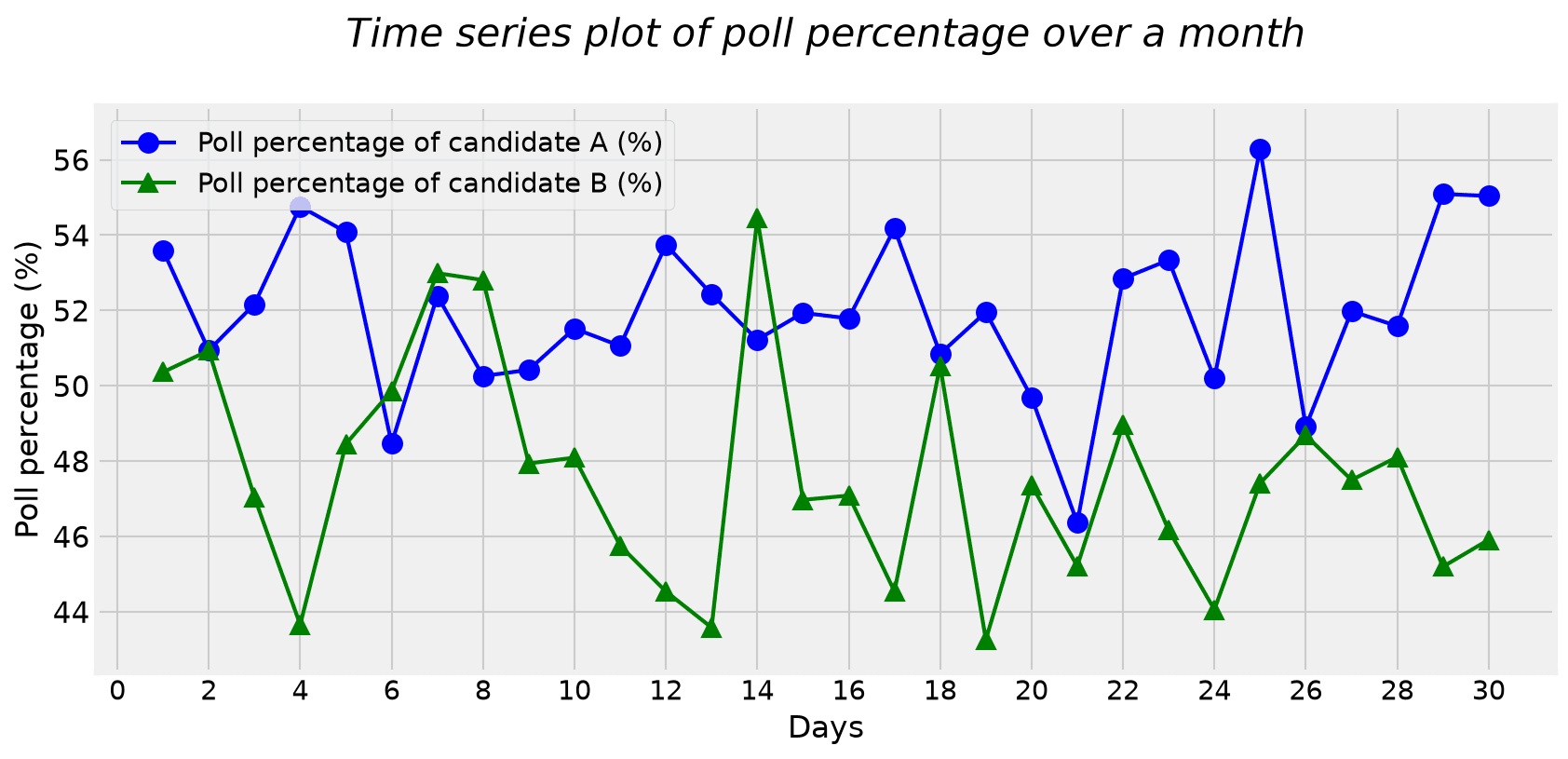
A Month of Polls, Drawn as Lines

python
np.random.seed(0)   # added
days = np.arange(1, 31)
candidate_A = 50 + days * 0.07 \
              + 2 * np.random.randn(30)
candidate_B = 50 - days * 0.1 \
              + 3 * np.random.randn(30)

plt.style.use('fivethirtyeight')
plt.plot(days, candidate_A, 'o-', c='blue')
plt.plot(days, candidate_B, '^-', c='green')
  • A: +0.07 a day, B: -0.1 a day, plus random noise
  • plt.style.use stays on for every later plot
Line plot of both candidates over 30 days

The Parts of a Boxplot

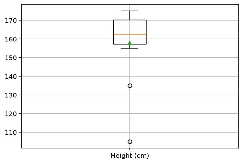
  • Median: the middle of the sorted values, the line in the box
  • Q1 and Q3: the quartiles; the box holds the middle half
  • IQR = Q3 - Q1, the length of the box
  • Fences at 1.5 IQR beyond the box decide what is unusual
  • Whiskers reach the farthest values inside the fences; outliers beyond them are circles

Step 1 of 5

Worked Example: Box of the 12 Heights

Sort, then find the median

text
sorted:   105 135 155 158 159 160 165 168 170 171 173 175
position:   0   1   2   3   4   5   6   7   8   9  10  11
p = 0.5 (n − 1) = 0.5 × 11 = 5.5
Q2 = 160 + 0.5 × (165 − 160) = 162.5

Step 2 of 5

Step 2: The Quartiles Q1 and Q3

Q1 = 155 + 0.75 × (158 − 155) = 157.25
Q3 = 170 + 0.25 × (171 − 170) = 170.25

Step 3 of 5

Step 3: IQR and the Fences

Q3 − Q1 = 170.25 − 157.25 = 13
Q1 − 1.5 × 13 = 137.75 Q3 + 1.5 × 13 = 189.75

Step 4 of 5

Step 4: Whiskers and Outliers

Fences: 137.75 and 189.75

PartValueWhy
Lower whisker155smallest height at or above 137.75
Upper whisker175largest height at or below 189.75
Outliers105, 135below the lower fence: P9 and P2, the children

Step 5 of 5

Step 5: The Mean, and the Check

python
plt.boxplot(x=[height], showmeans=True)
μ = 189412 ≈ 157.83
Boxplot of the 12 heights with two outliers and the mean as a triangle

Try It: Build the Boxplot Step by Step

The Notebook's Boxplot of the Polls

python
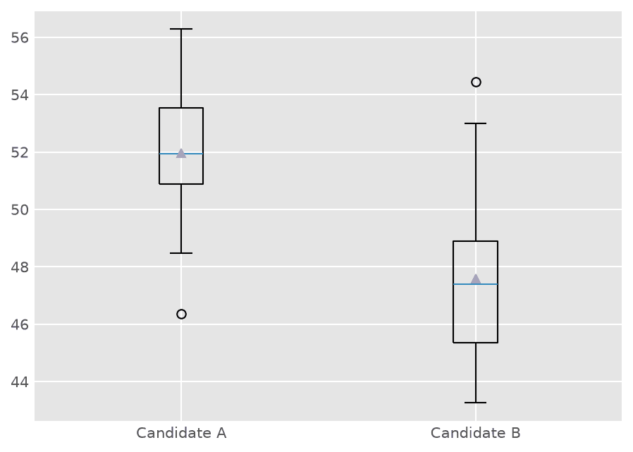
plt.style.use('ggplot')
plt.boxplot(x=[candidate_A, candidate_B],
            showmeans=True)
plt.xticks([1, 2], ['Candidate A', 'Candidate B'])
AB
Median51.94747.389
Q1 to Q350.87 to 53.5345.35 to 48.89
Outlier46.36454.452
Mean51.97147.581
Side-by-side boxplots of the two candidates

Part 3

Pandas and Seaborn on the Wine Data

Name the columns, let the library do the rest

Load the Wine Data

python
df = pd.read_csv("https://raw.githubusercontent.com/tirthajyoti/"
                 "Stats_data_science_ValleyML/master/Notebooks/Data/wine.data.csv")
df.head()
  • df.shape is (178, 14): 178 wines, 14 columns
  • Class takes the values 1, 2, 3 (59, 71 and 48 wines)
  • 13 measurements, such as Alcohol, Flavanoids, Color intensity, Proline

Pandas Plots Straight from a DataFrame

python
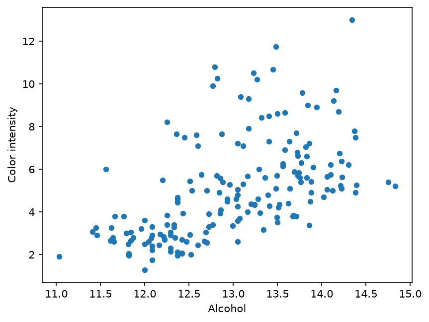
df.plot.scatter('Alcohol', 'Color intensity')
plt.show()
  • Name the columns; no lists to pass
  • Pandas calls Matplotlib for you, so plt.xlabel and friends still work
  • Each dot is one wine
Pandas scatter plot of Alcohol against Color intensity

Worked Example: 20 Bins of Alcohol

python
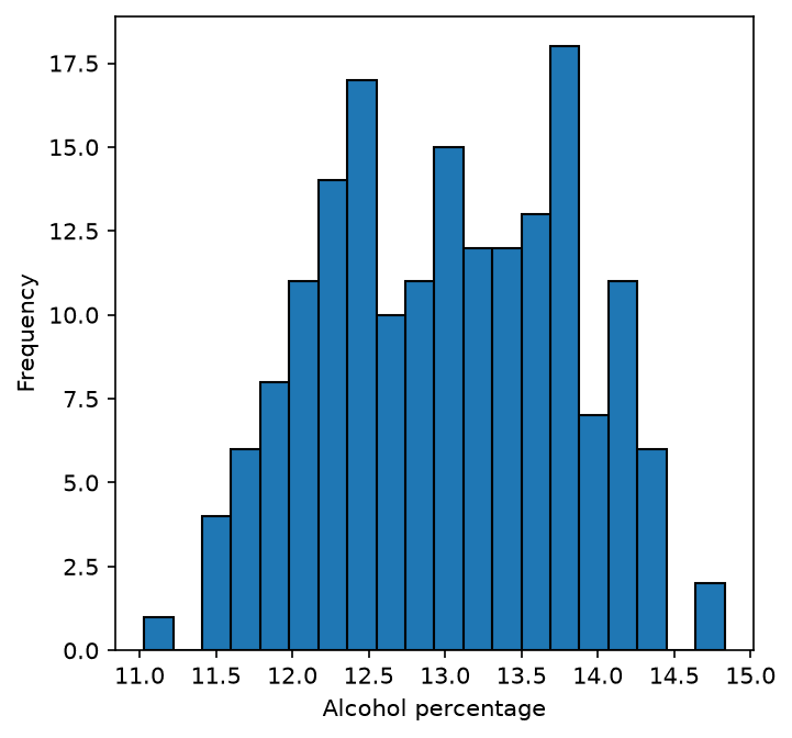
df['Alcohol'].plot.hist(bins=20, figsize=(5, 5),
                         edgecolor='k')
w = 14.83 − 11.0320 = 3.8020 = 0.19
Histogram of Alcohol with 20 bins

Seaborn: One Box per Class

python
import seaborn as sns

sns.boxplot(x='Class', y='Alcohol', data=df)
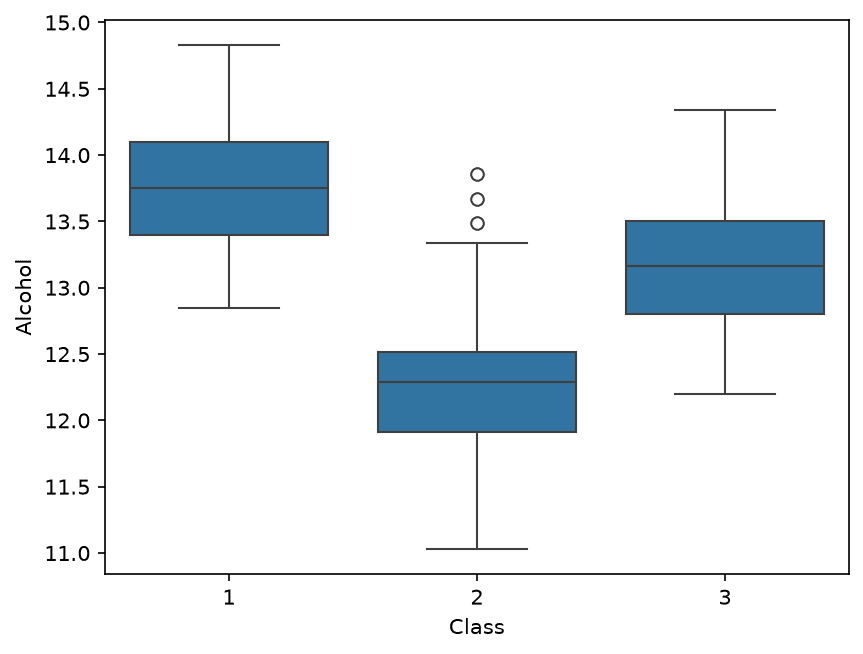
Seaborn boxplots of Alcohol for each Class

Violin Plot

python
sns.violinplot(x='Class', y='Alcohol', data=df)
Violin plot
A boxplot plus the shape of the distribution: the width at each height shows how many wines have that value.
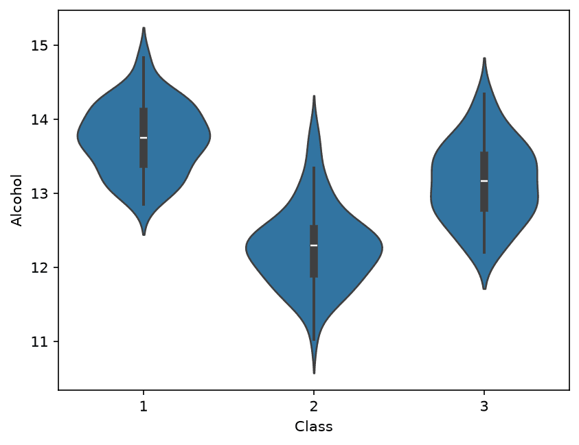
Seaborn violin plots of Alcohol for each Class

regplot: A Scatter Plot with a Fitted Line

python
sns.regplot(x='Alcohol', y='Color intensity',
            data=df)
  • The line that fits the dots best: a linear regression, next week's topic
  • The shaded band is the confidence interval: how unsure the line is
  • Fitted here: slope 1.560, intercept -15.226
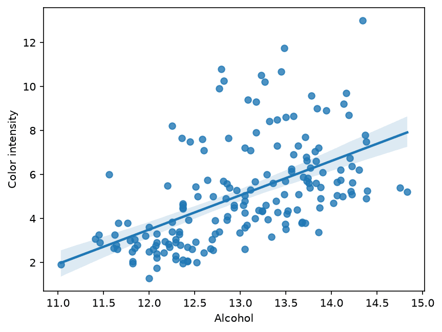
Seaborn regplot of Alcohol against Color intensity with a regression line

Worked Example: Read the Line at Alcohol 13

ŷ = 1.560 x − 15.226
ŷ = 1.560 × 13 − 15.226 ≈ 5.05

lmplot: One Line per Group

python
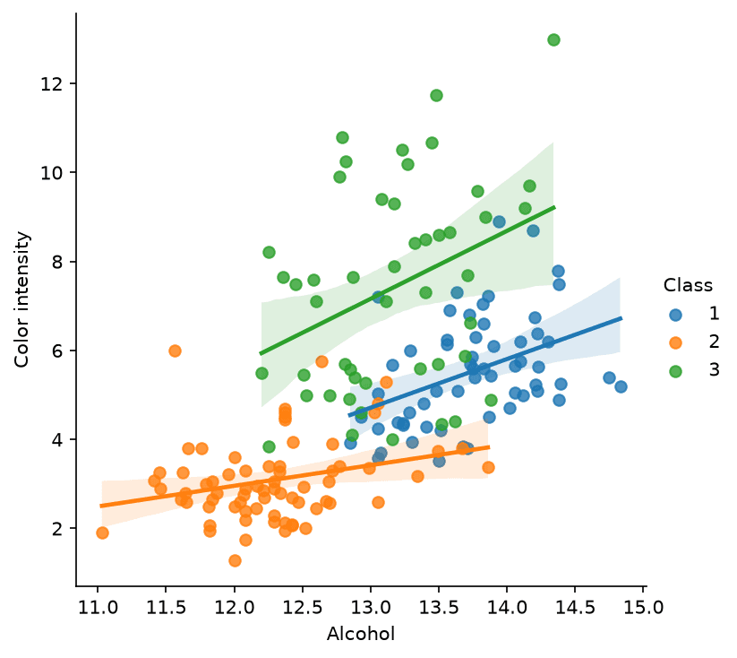
sns.lmplot(x='Alcohol', y='Color intensity',
           hue='Class', data=df)
  • hue='Class' colours the dots by class and fits one line per class
ClassSlope
11.094
20.464
31.527
Seaborn lmplot with one regression line per Class

Part 4

Correlation and the Heatmap

Every pair of columns in one picture

The Correlation Coefficient r

r = ∑ (x − μx)(y − μy)√(∑ (x − μx)2 × ∑ (y − μy)2)
  • r near 1: high values of x go with high values of y
  • r near -1: high x goes with low y
  • r near 0: no straight-line relation

Step 1 of 2

Worked Example: r for Four Patients

P1, P4, P6, P10: heights 160, 165, 168, 171 and weights 55, 68, 60, 65

PatientDeviationsProductSquares
P1-6, -74236, 49
P4-1, 6-61, 36
P62, -2-44, 4
P105, 31525, 9
Sum4766, 98

Step 2 of 2

Step 2: Combine into r

r = 47√(66 × 98) = 4780.424 ≈ 0.584

The Correlation Matrix and Its Heatmap

python
corr_mat = np.corrcoef(df, rowvar=False)
corr_mat.shape      # (14, 14)
corr_df = pd.DataFrame(corr_mat,
    columns=df.columns, index=df.columns)
sns.heatmap(corr_df, linewidth=1,
            cmap='plasma')
  • rowvar=False: the variables are the columns
  • 14 x 14 = 196 values of r
  • Diagonal is 1; the matrix is symmetric
  • Yellow: r near 1; dark blue: most negative
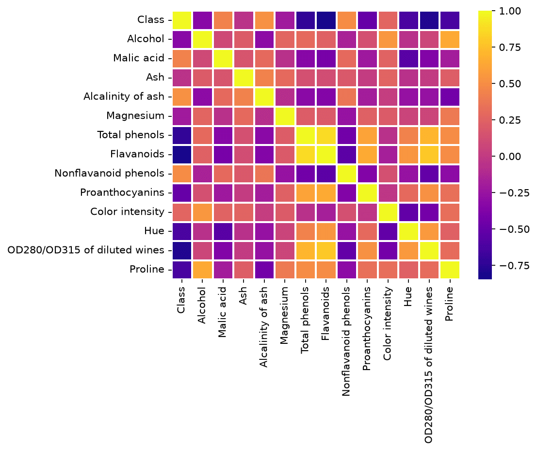
Heatmap of the 14 by 14 correlation matrix of the wine data

Worked Example: Read the Heatmap

QuestionAnswerr
Most related to ClassFlavanoids-0.847
Next twoOD280/OD315, Total phenols-0.788, -0.719
Most related pairTotal phenols and Flavanoids0.865
Least related pairAsh and OD280/OD3150.004

Choosing a Chart

QuestionChart
Do two numbers move together?scatter, regplot
How does a number change over time?line
How do named items compare?bar
QuestionChart
What shape does one column have?histogram
How do groups differ in spread?box, violin
Which of many columns are related?heatmap

Try It: The Chart Chooser

Common Mistakes

  • A line plot through rows that have no order, such as the 12 patients
  • Judging a histogram with one bin count only
  • Forgetting that plt.style.use stays on for later plots
  • Deleting boxplot outliers without checking them: they are only values beyond 1.5 IQR
  • Reading r = 0 as "no relation": r only sees straight-line relations
  • Treating a correlation as a cause

Project Milestone: Project/Paper Proposal

  1. State the idea, or the paper you will reproduce, in two or three sentences
  2. Name the dataset: source, rows, columns, and the target column
  3. Draw a histogram of the target, or a bar chart of its classes
  4. Draw a boxplot or scatter of the target against the column you expect to matter most
  5. Draw the correlation heatmap and note the strongest relations
  6. Put the plots in the proposal, with one sentence under each

Practice

Practice: Your Turn

About 30 minutes

About 7 minutes

Practice 1: A Histogram by Hand

w = 44 − 124 = 8
BinValuesCount
12 to 2012, 152
20 to 2821, 22, 263
28 to 3630, 31, 333
36 to 4438, 442

About 8 minutes

Practice 2: A Boxplot by Hand

PartPositionValue
Q10.25 x 9 = 2.2555 + 0.25 x 2 = 55.5
Median0.5 x 9 = 4.558 + 0.5 x 2 = 59
Q30.75 x 9 = 6.7561 + 0.75 x 2 = 62.5

About 5 minutes

Practice 3: r by Hand

∑ (x − μx)(y − μy) = 4.5 + 0.5 + 0 + 6 = 11
r = 11√(5 × 26) = 1111.402 ≈ 0.965

About 10 minutes

Practice 4: In Colab, on the Wine Data

  1. sns.boxplot(x='Class', y='Flavanoids', data=df): which class has the highest median? Which boxes show outliers?
  2. df['Proline'].plot.hist(bins=10): how many wines in the tallest bin, between which edges? (np.histogram gives exact numbers)
  3. sns.regplot(x='Total phenols', y='Flavanoids', data=df): slope sign? r with np.corrcoef?
  4. Heatmap of ['Class', 'Alcohol', 'Flavanoids', 'Proline'] only: which pair has the largest |r|?

Practice 4: Answer

TaskAnswer
1Medians 2.98, 2.03, 0.685: class 1. Outliers: class 2 (5.08), class 3 (1.57)
241 wines between 558.4 and 698.6
3Positive: slope 1.380, r = 0.865
4Class and Flavanoids, r = -0.847, the same as in the full heatmap

Key Takeaways

  1. Matplotlib builds a figure call by call: data, then title, labels, ticks, text, lines, legend
  2. A histogram cuts the range into equal bins; the bin count changes the picture
  3. A boxplot shows median, quartiles, whiskers to 1.5 IQR, and outliers beyond
  4. Pandas and Seaborn plot DataFrame columns by name; x= or hue= splits by group
  5. r measures straight-line relation; a heatmap shows every pair at once
  6. Pick the chart from the question: time, compare, shape, spread, relation

Open this lesson

Mahmoud AbasData Visualization with Matplotlib and Seaborn

Machine Learning (2026-2027) - Data Visualization with Matplotlib and Seaborn